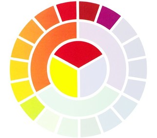
Primary colours
- Primary colours are types of colours that are combined together to make different shades of colours.
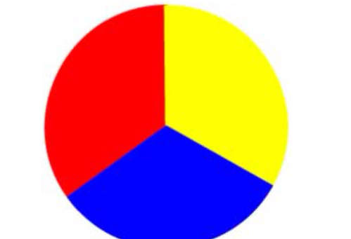
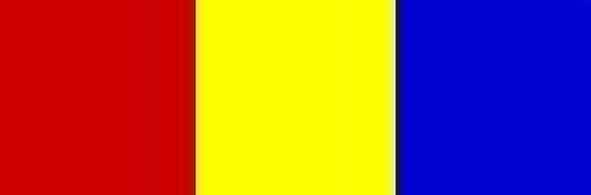
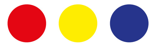
- Primary colours in a RYB wheel are usually red, yellow, and blue.
- These colours can be combined in different sizes, brightness, tints (bright colours), and shades (dark colours).
-Combining all primary colours (red, yellow, and blue) together would cause the colour to become black.
-Primary colours are used in pigments of paints, inks, coloured fabrics, and coloured coatings.
Examples of Primary colours in a RYB wheel:
|
|
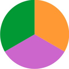
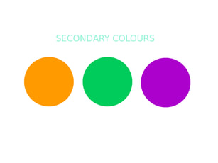
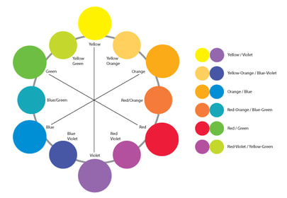
Secondary colours
-Secondary colours are types of colours that are made through mixing two primary colours together.
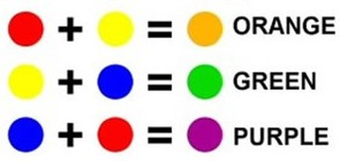
- Secondary colours in a RYB colour wheel are green, orange, and purple.
- Combining red and yellow primary colours make orange.
- Combining yellow and blue primary colours make green.
- Combining blue and red primary colours make purple.
- Just like with primary colours, secondary colours can also be combined with tints and shades.
Examples of Secondary colours in a RYB wheel:
|
|
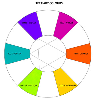
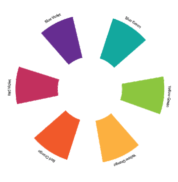
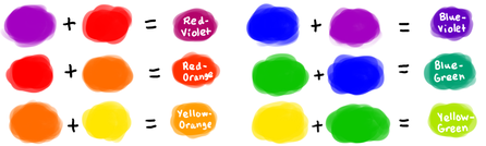
Tertiary colours
- Tertiary colours are colours that are made by combining both primary and secondary colours together.
-In a RYB colour wheel, the six main types of tertiary colours are red-orange, yellow-orange, yellow-green, blue-violet, red-violet, and blue-green.
-Combining red and orange make red-orange.
-Combining orange and yellow make yellow-orange.
-Combining yellow and green make yellow-green,
-Combining blue and violet make blue-violet.
-Combining red and violet make red-violet.
-Combining blue and green make blue green.
-Tints and shades can also be added in tertiary colours as well.
Examples of tertiary colours in a RYB wheel:
|
|
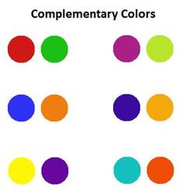
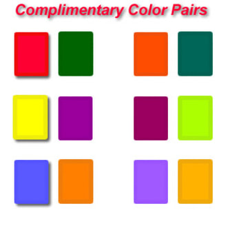
Complementary colours
- Complementary colours are types of colours that are opposite from each other in a colour wheel.
- Examples of complementary colours are red and green, orange and blue.
- Complementary colours are usually in groups of 2 colours
- When used at a full saturation, complementary colours can create colours that have a strong and rich look.
- However, complementary colours can be difficult to use for large measurements of colour,
- Usually complementary colours do not work well when using text.
- These colours are also used for balance in Colour therapy.
Examples of complementary colours in a RYB wheel:
|
|
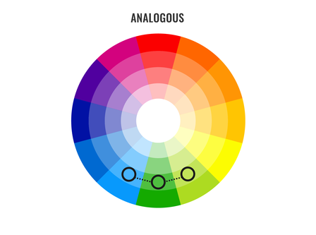
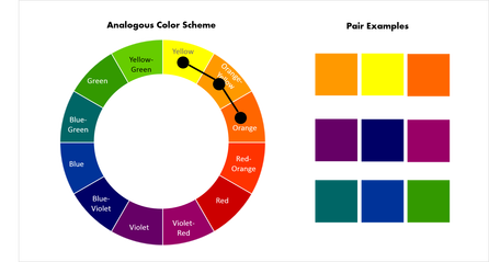
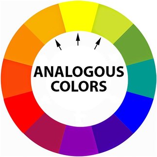
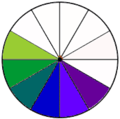
Analogous colours
- Analogous colours are colours that are beside each other on a colour wheel.
- An example of Analogous colours are orange, yellow-orange, and yellow colours that are combined together.
- Analogous colours are usually in groups of 3 colours.
- Analogous colours usually work well together and that these colours also have a tendency to make designs that are usually both relaxing and peaceful.
- Analogous colours are usually used in nature and that these colours can be both melodic and appealing to look at.
- When using analogous colours, the first colour should be the dominant colour, the second colour should be the supporting colour, and the third colour should be the accented colour.
Examples of analogous colours in a RYB wheel:
|
|
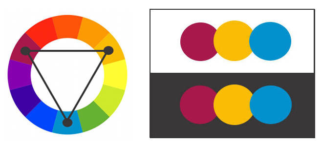
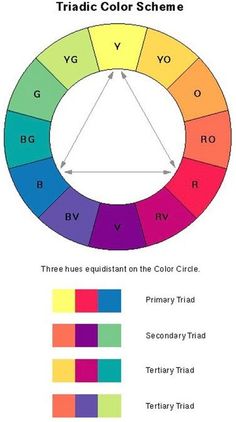
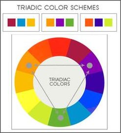
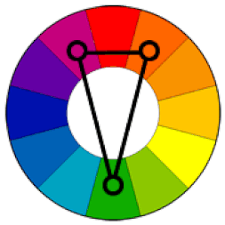
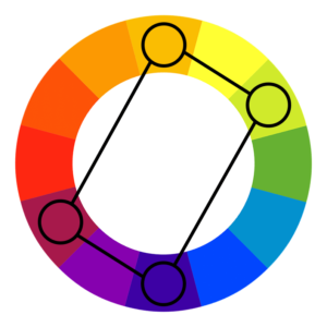
Triadic colours
- Triadic colours are colours that evenly space out around the colour wheel. Usually the best way to place these colours on the wheel is by using a triangle that has equal sides of colour in the wheel.
- The three types of triadic colours are primary, secondary, and tertiary triads.
- Primary triads consist of red, orange, and yellow colours while secondary colours consist of of orange, purple, and green colours. An example of tertiary triads are yellow-orange, blue-green, and red-violet colours combined together.
- Triadic colours also are in groups of 3 colours.
- Usually Triadic colours look rich and colourful, even if the colours that are used are both light and unsaturated.
- When using Triadic colours, the colours that are used should have balance. The first colour should be dominant, while the other two colours should be accented.
Examples of Triadic colours in a RYB wheel:
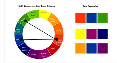
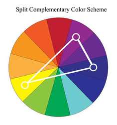
Split complementary colours |
|
- Split complementary colours are a similar form of the complementary colour scheme but it involves a base colour with two secondary colours. Instead of using colours that are complementary, split complementary uses two colours that are evenly placed around the complementary colour in a colour wheel.
- An example of split complementary colours are orange, red violet, and green colours combined together.
- Split complementary colours come in groups of 3 colours.
- Split complementary colours have a similar visual difference with complementary colours, but it has lesser traction in the colour.
- For beginners, split complementary colours are a good option because the split complementary colour scheme is usually a difficult scheme to mishandle.
- When using split complementary, the base colour is the dominant colour while the two secondary colours are used as accented colours.
Examples of split complementary colours in an RYB wheel:
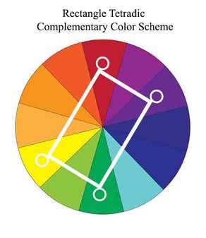
Rectangular colours (Tetradic) |
|
- Rectangular colours are colours that involves the use of four different types of colours that are separated into complementary colour pairs of two.
- An example of rectangular colours are green, blue, red, and orange colours combined together. Green and red are complementary to each other, while orange and blue are complementary to each other, forming two complementary pairs.
- Rectangular colours usually have plenty of differences in colour.
- The best way to use rectangular colours is by allowing one of the four colours to be the dominant colour.
- It is important to pay close attention to the balance of warm and cool colours when using rectangular colours for designing purposes.
Examples of rectangular colours in a RYB wheel:
|
|
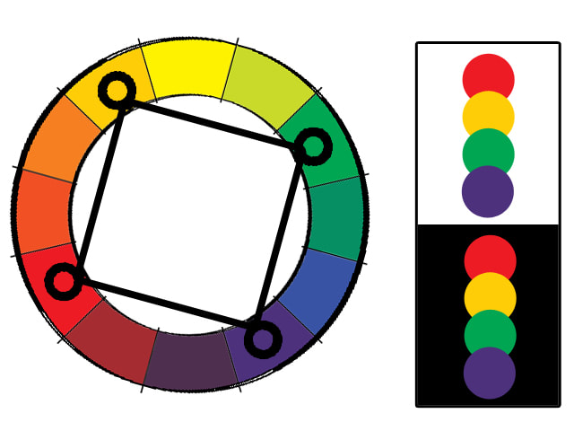
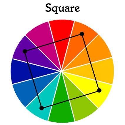
Square colours
- Square colours are colours that has a similar concept to the rectangular colour scheme, however this time the four colours evenly space out in the colour wheel. Square colours also feature two complementary pairs as well.
- An example of square colours are red, yellow orange, green, and blue violet colours combined together. Red and green are complementary to each other, while yellow orange and blue violet are complementary to each other, forming two complementary pairs.
- Square colours also work best by allowing one of the four colours to be dominant.
- Balance of warm and cool colours should also be a point of emphasis when using square colours for designing.
Examples of square colours in a RYB wheel:
Warm colours |
|
- Warm colour are colours that are considered to be both energetic and happy.
- Warm colours are colours that involve red, orange, and yellow colours.
- Warm colours usually relate well with warm objects such as sunshine and heat.
- Warm colours relate to the seasons spring and autumn.
- Warm colours are used to help make rooms in houses look more relaxing and comfortable.
- Warm colours can also show energy and warmth in a design.
- Warm colours can also feel very fearless and forceful and therefore are aggressive colours.
Examples of warm colours in an RYB wheel:

Cool colours |
|
- Cool colours are colours that have calming and easing effects.
- Cool colours are colours that involve blue, green, and purple colours.
- Cool colours relate well with water, sky, ice, and snow.
- Cool colours relate to the seasons summer and winter.
- Cool colours are ideal for smaller rooms that can look bigger and more spacious.
- Cool colours usually bring feelings of sadness and uneasiness and that cool colours can show signs of coldness in a design as well.
- Cool colours are less aggressive than warm colours.
Examples of cool colours in a RYB wheel:
|

|
|
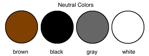
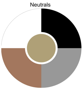
Neutral colours
- Neutral colours are colours that are not included in the colour wheel and that they are colours that do not have any form of hue (pure colour).
- Neutral colours are formed by combining two kinds of any complementary colours (for example red and green) or by also incorporating any kind of colour in the colour wheel with black, white, or gray.
- Neutral colours include lighter colours such as gray, white, and beige and that neutral colours also include darker colours such as black, brown, and tan.
- Light neutral colours such as gray, white, and beige are what makes pure neutral colours.
- Dark neutral colours such as black, black, and tan are what makes near neutral colours.
- Using white with any small quantity of colour in the colour wheel is considered a neutral colour.
- Usually neutral colours symbolizes positive feelings such as calm and peace, however neutral colours can also symbolize negative feelings such as dissatisfaction, boredom, and frustration.
Pictures of neutral colours:
|
|
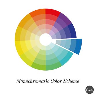
Monochromatic colours
- Monochromatic colours are colours that uses a variation of only one colour by either making it darker or brighter.
- Monochromatic colours only uses shades of only one hue of colour that are made through changing the amount of brightness and saturation in a base colour.
- Usually black and white colours are always involved in monochromatic colours because white can make the base monochromatic colour brighter while black can make the base monochromatic colour darker.
- Monochromatic colours are usually very relaxing and smooth to look at even if its base colour is warm/aggressive.
- Accented and highlighted colours are usually harder to find in monochromatic colours.
Examples of monochromatic colours in RYB wheel:
Hue |
|
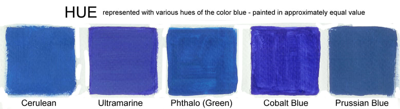
- Hue is a term used that describes how a colour can be similar to or different from all the colours in the colour wheel.
-Hue is what describes the name of the colour.
- For example, when describing a colour as "reddish orange", it means that it is defined using two hues.
- One hue of colour can also have many different names and variations of that colour.
- For example, a hue of red includes colours such as pink and maroon.
- One hue of colour can change depending on how bright or dark the hue of colour is.
- Usually, there is not plenty of hues, however there are plenty of colours to choose from.
Examples of hue in a RYB wheel:
|
|
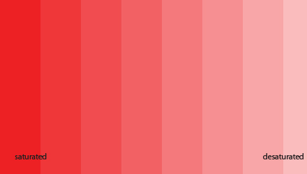
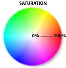
Saturation
- Saturation is what shows how intense the brightness or darkness of a colour is.
- Increasing saturation causes colour to become darker.
- Decreasing saturation causes colour to become lighter.
- For example, when saying colours such as "light red" or "dark blue", it shows the change in saturation for each colour. The colour light red means that the saturation of red is lower or decreased, while the colour dark blue means that the saturation of blue is higher or increased.
Examples of saturation in RYB wheel:
|
|
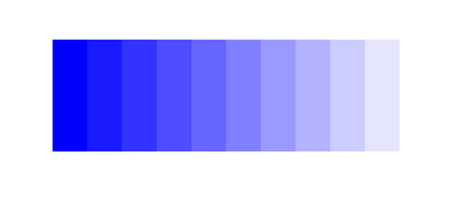
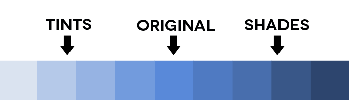
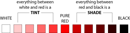
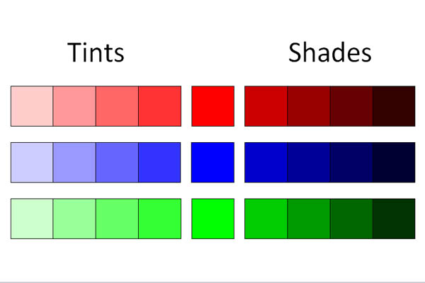
Tints and shades
- Tints are a result of including white to a colour in a colour wheel, while shades are a result of including black to a colour in a colour wheel. Tints causes colours to be brighter, while shades causes colours to be darker.
- Both tints and shades allow different monochrome colours to be created by simply including layers of white or black to a base colour.
- For example, if the base colour used is light red, then sets of monochrome colours can be created by adding two kinds of tints (two brighter reds) and two kinds of shades (two darker reds)
Examples of tints and shades in a RYB wheel:
|
|
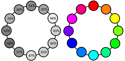
Luminance
- Luminance is the term used to show and describe how bright an colour is.
- Colours usually can become lighter or darker by altering its lightness, however in luminance, each colour has individual luminance values.
- Blue has the smallest amount of luminance value (44%) while yellow has the largest amount of luminance value (94%)
- It is important to remember luminance values of hues because it makes it easier for hues to work well with colour.
- Hues with luminance values above 50% causes luminance levels to become smaller when saturation levels become smaller.
- Hues with luminance values below 50% causes luminance levels to become larger when saturation levels become larger.
- Smaller luminance values causes the colour to be darker.
- Larger luminance values causes the colour to be lighter.
Examples of Luminance in RYB wheel:
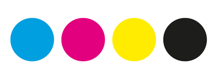
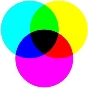
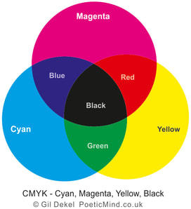
CMYK colours
- CMYK colours are the main colours that are used for printing images/text with colour in printers.
- CMYK colours are subtractive colours because it has to use light reflecting from images/words that were printed.
- In CYMK colour schemes, cyan, magenta, yellow, and black are the primary colours.
- In CYMK colour schemes, blue, red, and green are the secondary colours, which are caused by combining the primary CMYK colours together.
- Combining cyan and magenta colours make blue.
- Combining magenta and yellow colours make red.
- Combining yellow and cyan colours make green.
- Tints and shades can be added to CYMK colours to make it brighter or darker.
Examples of CYMK colours (both primary and secondary) :
|
|
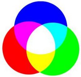
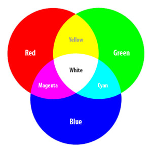
Addictive colours (RGB colours)
- RGB colours are the main types of colour that are used for computer monitors, usually found in graphics, programming, web browsers, and web pages.
- RGB colours are also used in TV and movie screens as well.
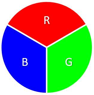
- In RGB colour schemes, the primary colours are red, green, and blue.
- In RGB colour schemes, the secondary colours are yellow, cyan, and magenta, caused by combining the primary RGB colours together,
- Combining red and green primary colours make yellow.
- Combining green and blue primary colours make cyan.
- Combining blue and red primary colours make magenta.
- Tints and shades can also be added to RGB colours to make it brighter or darker.
- RGB colours are also used in TV and movie screens as well.
- In RGB colour schemes, the primary colours are red, green, and blue.
- In RGB colour schemes, the secondary colours are yellow, cyan, and magenta, caused by combining the primary RGB colours together,
- Combining red and green primary colours make yellow.
- Combining green and blue primary colours make cyan.
- Combining blue and red primary colours make magenta.
- Tints and shades can also be added to RGB colours to make it brighter or darker.
Examples of addictive colours (both primary and secondary):
|
|
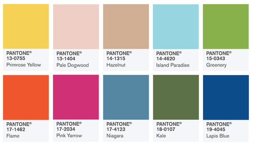
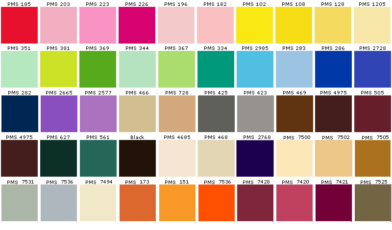
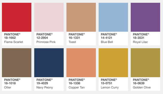
Pantone colours (PMS colour system)
- The PMS colour system is a colour matching system that printing industries use to help produce spot colours, which are colours that allow colour to be printed through its own type of ink.
- Applications that do colour printing well can clearly identify different types of colours by specifying the name or number of the pantone.
- PMS colour systems usually work efficiently with spot colours, but does not work as well with process colours, which are usually identified and described through the CYMK colour scheme.
Examples of pantone colours:
|
|
Works cited/links:
http://www.colourtherapyhealing.com/colour/complementary-colours
O'Grady, Neal. "Web Design 101: Color Theory | Webflow Blog." RSS. Webflow, 31 July 2017. Web. 24 Oct. 2017. https://webflow.com/blog/web-design-101-color-theory
"Split Complementary Color Scheme." Split Complementary Color Scheme - Colorpedia. Colorpedia, 26 Apr. 2016. Web. 24 Oct. 2017 http://www.paletton.com/wiki/index.php?title=Split_complementary_color_scheme
"Color Schemes - Triadic." Triadic Scheme Colors. Color Bay, 2003. Web. 24 Oct. 2017. http://colorbay.com/triadic.htm
"Basic Color Schemes - Introduction to Color Theory." Basic Color Schemes: Color Theory Introduction. Tiger Color, 2000. Web. 25 Oct. 2017. http://www.tigercolor.com/color-lab/color-theory/color-theory-intro.htm
Flanagan, Lauren. "Learn How to Use Warm and Cool Colors." The Spruce. The Spruce, 21 Sept. 2017. Web. 25 Oct. 2017. https://www.thespruce.com/understanding-warm-and-cool-colors-1976480
Nafie, Coral. "Design Primer: Understanding Monochromatic Color Schemes." The Spruce. The Spruce, 20 Sept. 2017. Web. 25 Oct. 2017.
https://www.thespruce.com/what-is-a-monochromatic-color-scheme-1973826
"Monochromatic Color Scheme." Monochromatic Color Scheme - Colorpedia. Colorpedia, 25 Apr. 2016. Web. 25 Oct. 2017
http://www.paletton.com/wiki/index.php?title=Monochromatic_color_scheme
Rachel Hayes, Art Professor Follow. "Color Review & Johannes Itten." LinkedIn SlideShare. LinkedIn SlideShare, 01 Oct. 2012. Web. 25 Oct. 2017.
https://www.slideshare.net/rachelchayes/color-review-johannes-itten
"Color Luminance." Color Luminance: Perceived Brightness, Luminance and Contrast. Work with Color, 2013. Web. 25 Oct. 2017.
http://www.workwithcolor.com/color-luminance-2233.htm
Morton, J.L. "Color Systems - RGB & CMYK." Color Systems - RGB & CMYK. Color Matters, 1995. Web. 25 Oct. 2017.
https://www.colormatters.com/color-and-design/color-systems-rgb-and-cmyk
Jewett, Tom. "RGB: Red, Green, Blue." Color Tutorial - RGB. Tom Jewett's Color Tutorial, 2013. Web. 26 Oct. 2017.
http://www.tomjewett.com/colors/rgb.html
Jewett, Tom. "CMYK: Cyan, Magenta, Yellow, Black." Color Tutorial - CMYK. Tom Jewett's Color Tutorial, 2017. Web. 26 Oct. 2017.
http://www.tomjewett.com/colors/cmyk.html
Staff, -. Webopedia. "PMS - Pantone Matching System." What Is Pantone Matching System (PMS)? Webopedia Definition. Webopedia, 2017. Web. 26 Oct. 2017. https://www.webopedia.com/TERM/P/Pantone_Matching_System_PMS.html
"Spot Color." What Is Spot Color? Webopedia Definition. Webopedia, 2017. Web. 26 Oct. 2017. https://www.webopedia.com/TERM/S/spot_color.html
Milla, Mira. "20 Color Theory Facts You Should KnowNeutral Colors Are Also Known as Earth Tones." Complex. Complex, 20 Oct. 2016. Web. 26 Oct. 2017. http://www.complex.com/style/2014/08/color-theory-facts-you-should-know/neutral-colors-are-also-known-as-earth-tones
Sara, Christine. "Wonderful What Are The Neutral Colors 36 With Additional Layout Design Minimalist with What Are The Neutral Colors." Christinesaraphotography.com. Christine Sara Photography, 2013. Web. 27 Oct. 2017. http://christinesaraphotography.com/3184/what-are-the-neutral-colors-18-04-2017/wonderful-what-are-the-neutral-colors-36-with-additional-layout-design-minimalist-with-what-are-the-neutral-colors/
"Primary Colours." Primary Colours | Colour Therapy Healing. Colour Therapy Healing, 2017. Web. 30 Oct. 2017. http://www.colourtherapyhealing.com/colour/primary-colours
"Secondary Colours." Secondary Colours | Colour Therapy Healing. Colour Therapy Healing, 2017. Web. 30 Oct. 2017.
http://www.colourtherapyhealing.com/colour/secondary-colours
"Tertiary Colours." Tertiary Colours | Colour Therapy Healing. Colour Therapy Healing, 2017. Web. 30 Oct. 2017.
http://www.colourtherapyhealing.com/colour/tertiary-colours
"Complementary Colours." Complementary Colours | Colour Therapy Healing. Colour Therapy Healing, 2017. Web. 30 Oct. 2017.
http://www.colourtherapyhealing.com/colour/complementary-colours
