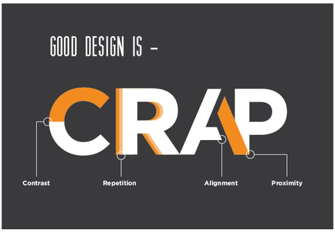
What is CRAP?
CRAP is a form of computer design concept that was introduced by American author Robin Patricia Williams and it is an acronym that symbolizes Contrast, Repetition, Alignment, and Proximity. It is important to have an understanding of all four principles of CRAP because it makes it easier to create a computer design or website that is successful over and over again. The four principles of CRAP should be used especially when making things such as designing an website or designing both computer advertisements and non-computer advertisements (such as banner advertisements). Finally, using all four principles of CRAP effectively could also make it easier to not only make successful computer designs, but also cause computer designs to stand out exceptionally well and also separate the good computer designs from the bad computer designs.
|
|
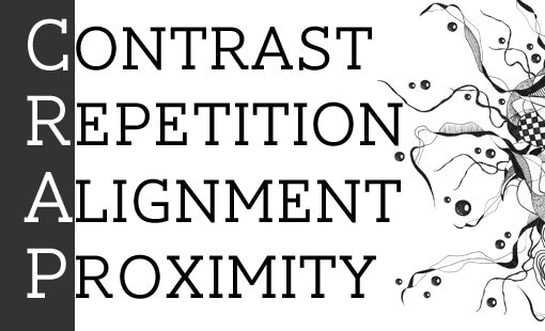
The four principles of CRAP
Contrast
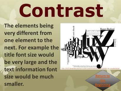
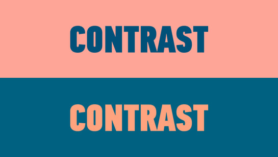
Contrast is a principle of CRAP that helps improve and make the elements of a computer design better and contrast helps the person using the computer put more emphasis and focus towards how the elements of a computer design should look like. Contrast is also the principle that shows how different one element and another element in a computer design is. Sometimes, contrasts used in a computer design usually only involve black and white colours, however, contrast can also use many different kinds of colours and that contrast can also be used when making computer designs through modifying the different elements that are in the computer design, adjusting the shapes in the design, adjusting how big or small the computer design should be, adjusting the size and type of fonts in the design, and many other features. Also, using contrast is important because it helps prevent causing all elements in the computer design to be too alike to each other.
|
|
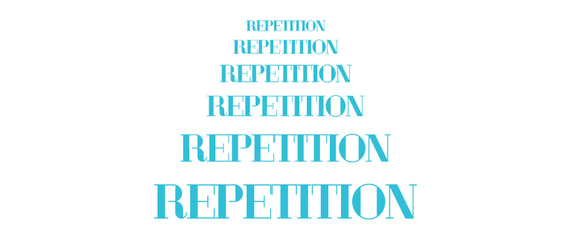
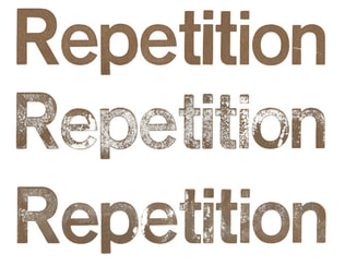
Repetition
Repetition is a principle of CRAP that helps sustain the same type of computer design and this also allows the people using the computer to become more used with the information seen in a computer design as well. Also, repetition is what also provides the character and personality in a computer design. Repetition can be used with the colour, shape, size, font, and other aspects in a computer design. Usually website companies design their websites through using the technique of repetition by using different kinds of colours, fonts, and shapes that help provide and maintain the same type and quality of computer design in their websites. Using repetition with elements are in a webpage is important because it makes it easier to build and increase consistency in a web design so that it will look more appealing.
|
|
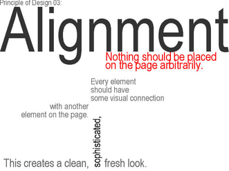
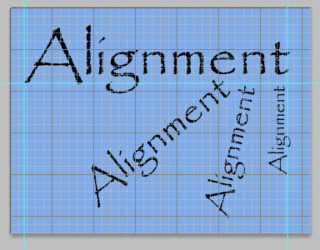
Alignment
Alignment is a principle of CRAP that helps control how an element is being used or placed in a computer design and is also a principle that helps keep the information in a computer design as structured and organized as possible. Alignment helps line up the elements in a computer design with one another. Every element in a webpage connects well with other types of elements in a computer design, which helps make the design more connected to each other. The different types of alignment in a computer design are left, justified, and right-centered, with left and right alignments usually the more familiar types. Usually centered alignment fits well with text that is not too long, while justified alignment works well with text that is longer and with fonts that are not big. Alignment is important because it makes it easier to visually connect an element with another element in a web design.
|
|
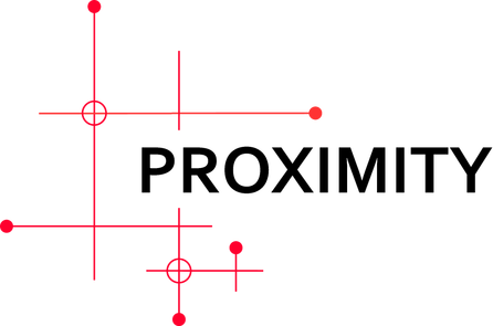
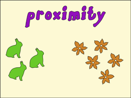
Proximity
Proximity is a principle of CRAP that explains how elements of a computer design that are closely related to each other should be placed or grouped near each other or be evenly spaced to each other. Using proximity is important towards improving the experience of the user when he/she creates a computer design. Usually a computer designer that is professional will make full use of proximity by emphasizing more towards creating a more realistic computer design by evenly placing each element in the computer design. However, there are also some computer designs that causes people using the computer to have a difficult time finding elements that are connected to each other, which makes it difficult to use proximity to place these elements near each other or evenly space them with each other. Finally, using proximity also helps make a computer design more orderly and neat to look at and that proximity helps decrease the amount of mess and disorganization found involving the elements in a computer design.
|
|
Effective and ineffective websites
Effective website example(s):
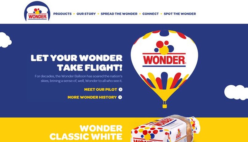
Wonder website
Why I think it is an example of an effective website:
- I thought that the designer did well in separating the contents of the website from different parts of the website through contrast by using white colour as background in the part of the website that has the navigation bar, using blue colour as background in the part of the website that says "Let your wonder take flight", and using yellow colour as background in the part of the website that says "Wonder classic white".
- I thought the designer also used contrast well by placing images that correspond well with what each part of the website says. In the part of the website that says "Let your wonder take flight", the designer used pictures of clouds and a hot air balloon with the logo Wonder on it to help relate with the text, while in the part of the website that says "Wonder classic white". the designer put a picture of Wonder classic bread to help relate with the text as well.
- I thought that the designer also did well with the use of font by using bold text with sans serif font for the parts of the website that have the titles and by using non-bold sans serif font for the parts of the website that explain what the title of each part of the website is. For example. titles such as "Let your wonder take flight" and "Wonder classic white" use the bold sans serif font, while the parts explaining these titles make use of the non-bold sans serif font. These fonts also blend well with the background colour and are easy to read as well.
- I thought that the designer used repetition well with the fonts used in the website. As such, the bold sans serif font that was used in the title"Let your wonder take flight" was again used in the title"Wonder classic white", while the non-bold sans-serif font that used with the contents explaining the title "Let your wonder take flight" was also used with the contents explaining the title "Wonder classic white".
- I thought that the designer also made use of alignment with the fonts by aligning the title "Let your wonder take flight" and its contents with the title "Wonder classic white" and its contents.
- Also, the right arrows beside the titles "Meet our pilot", "More wonder history", and "See all products" align with each other as well.
- I felt that designer make very good use of proximity by evenly spacing out the three boxes that says "Frankly good", "And its good", and "The walking bread". Also, contrast was being used as well by using red for the background colour of the "Frankly good" box, blue for the background colour of the "And its good" box, and yellow for the background colour of the "The walking bread" box.
- Proximity was also used when evenly spacing out the navigation bar at the top of the website (Products, Our story, Meet the wonder, etc). Small dots were also used in between the words in the navigation bar to further use more proximity and spacing between the words in the navigation bar.
- Also, the designer also used contrast well through using the primary colour scheme of red, yellow, and blue to help make the website look more appealing and realistic to look at due to the fact that the colours blend well together.
Link/page: https://www.wonderbread.com/
Non- Effective website example(s):
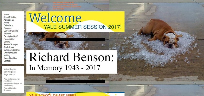
Yale University School of Art
What was wrong with the website:
- I felt that the designer did not use contrast very well because although there is some colour, the website is mostly white and that there is no hint or evidence of any colour scheme that is being used in the website.
- I also did not like the fact that the designer decided to not put pictures/text beside each other using proximity and that I did not like the fact that I have to scroll all the way down to find all pictures/text in the website.
- I did not like the way the designer chose the background on the website because using dog pictures as background is not the best choice for a university/school website.
- The use of font in the webpage is mostly plain and non-bold and that it does not make the website appealing to look at.
- Also, the designer decided to align all of the text and pictures used in the webpage on the left side of the webpage, which makes the webpage boring and dull to look at and therefore does not use proximity well due to the fact that the designer did not evenly spread out the contents in the webpage from left to right.
- The designer did not put a navigation/search bar on the webpage, which would have made it easier to search all contents in the webpage.
- Main webpage uses repetition through using pictures of the dog as background. Using background images as repetition is fine, but again, the background image that involves the concept of repetition should be appropriate to the website.
- I also felt that some of the non-background pictures that the designer placed on the website also do not relate well for a school/university website.
- The designer did not align/line up most of the pictures with each other because some of the pictures are bigger in size while the other pictures are smaller in size.
Suggestions to improve website using the principles of CRAP:
Overall, what I think the designer should have done to help make the website more appealing to look at and more successful to look at is by spreading out the text and images from left to right in the webpage and by using proximity to help evenly spread these out in the webpage, using more stylistic fonts to help make the text of the webpage look more appealing to look at, using more colours or using different colour schemes to help make the look and contrast of the website more realistic and professional to look at, placing a search/navigation bar (preferably on the top right part of the webpage), making the sizes of the images even to help create better alignment, and using images and background/non-background images that are related with a school/university website.
Link/page: http://art.yale.edu/Home
Works cited and links:
Deshdeep, Nitin. "Build Better User Experience With C.R.A.P. Design Principles." VWO Blog. VWO Blog, 03 Nov. 2017. Web. 11 Nov. 2017. https://vwo.com/blog/crap-design-principles/
Jones, Francis. "C.R.A.P Contrast The Elements Being Very Different from One Element to the Next. For Example the Title Font Size Would Be Very Large and the Text Information." SlidePlayer. SlidePlayer, 2017. Web. 14 Nov. 2017. http://slideplayer.com/slide/5938576/
Scocco, Daniel. "C.R.A.P.:The Four Principles of Sound Design." Daily Blog Tips. Daily Blog Tips, 2014. Web. 16 Nov. 2017. https://www.dailyblogtips.com/crapthe-four-principles-of-sound-design/
